
For an industry built on the thrill of discovery, tailor-made travel has become ironically predictable. When everyone’s offering “luxury escapes” and “award-winning service”, no one’s standing out.
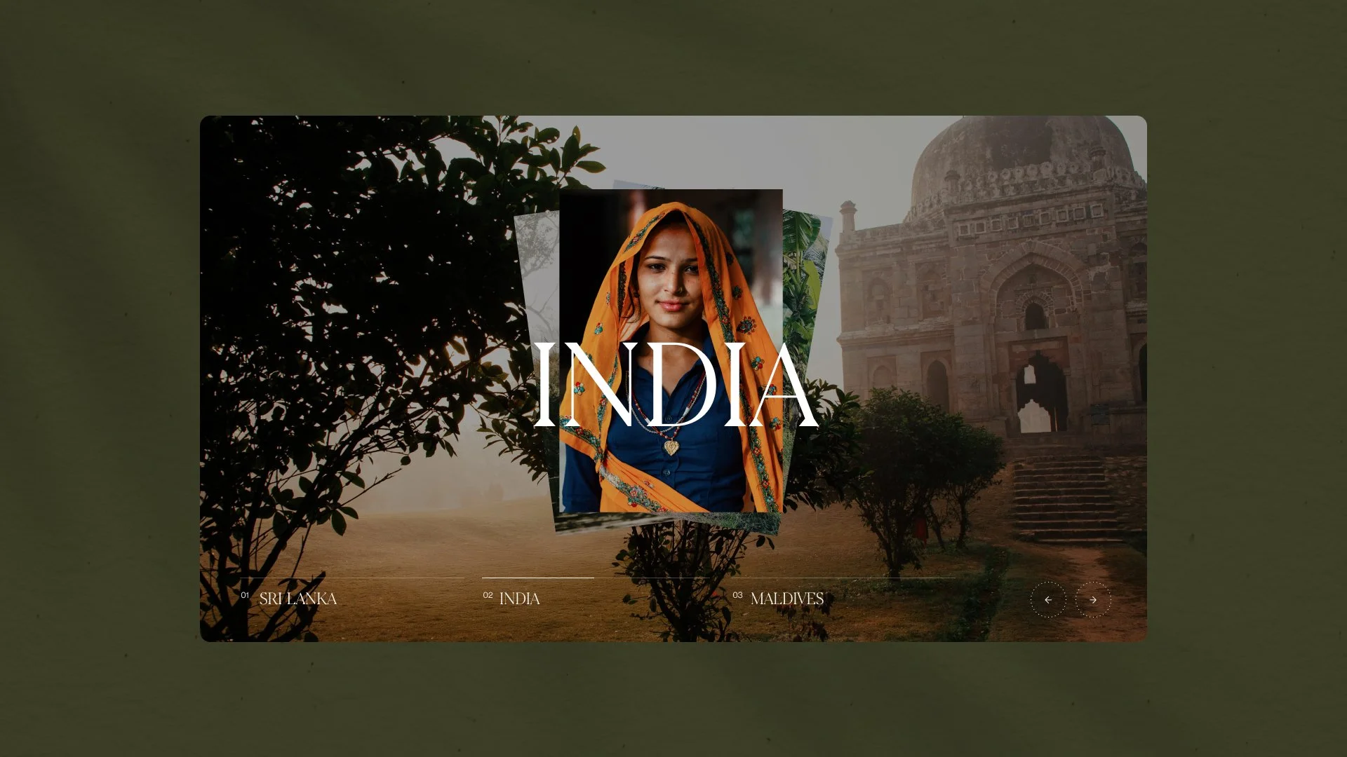
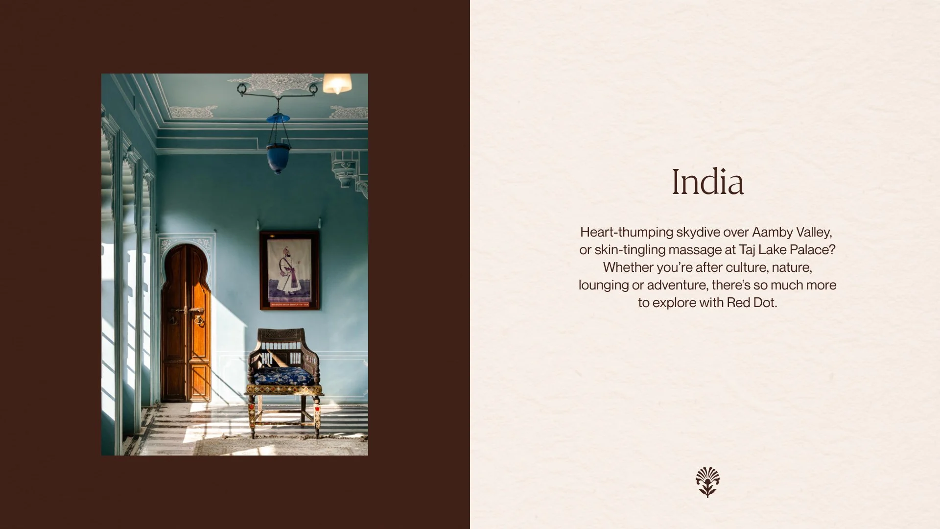
Red Dot is the outlier. With one foot in Colombo and the other in the UK, they take travellers to the heart of Sri Lanka, India, Bhutan, and the Maldives, offering a rare richness of experience far from the well-trodden path.
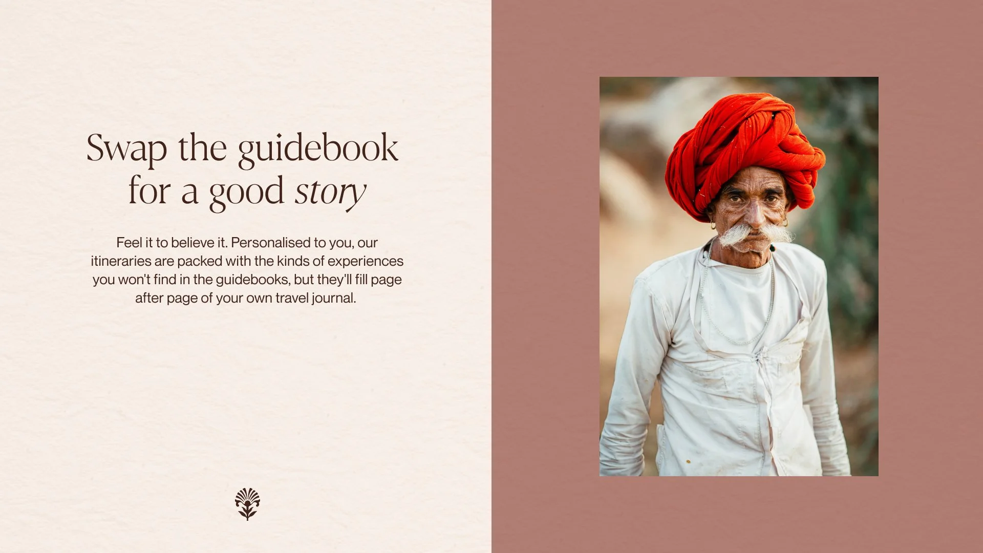
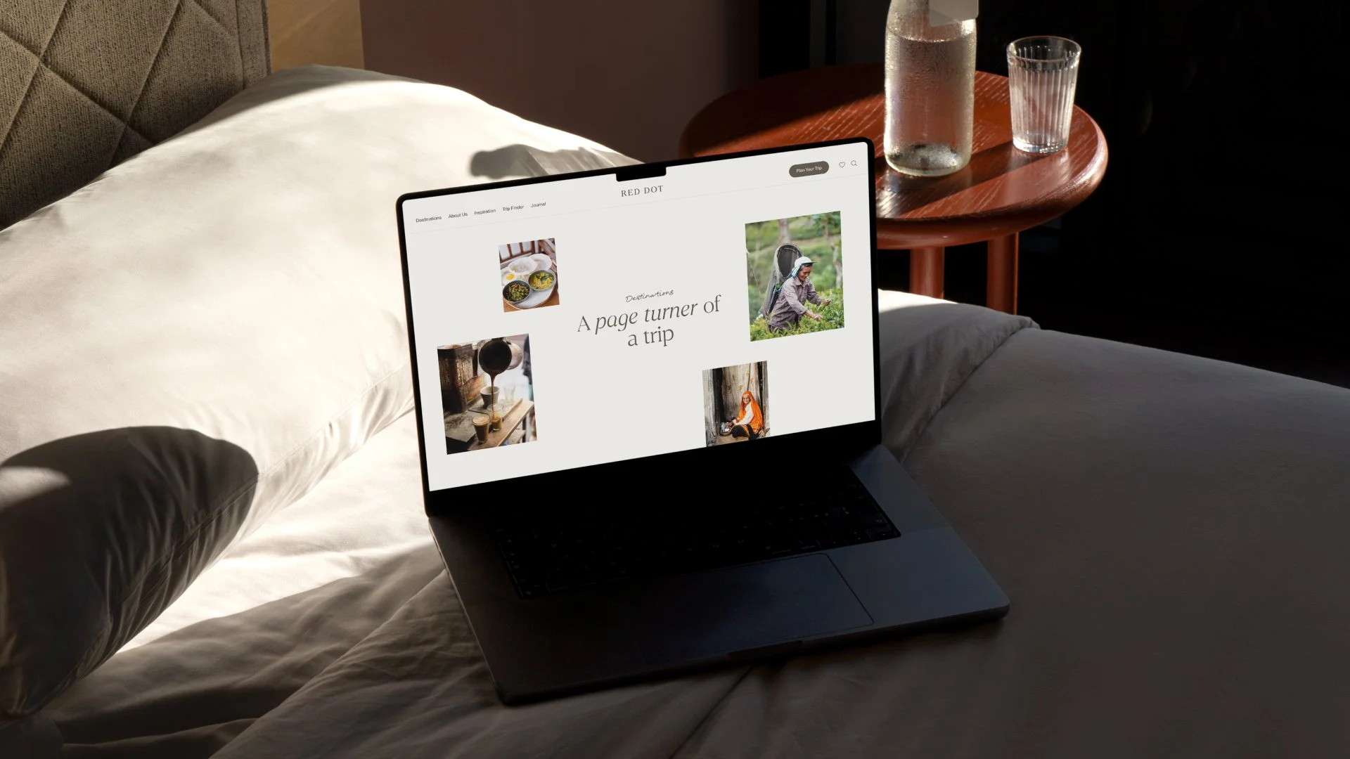
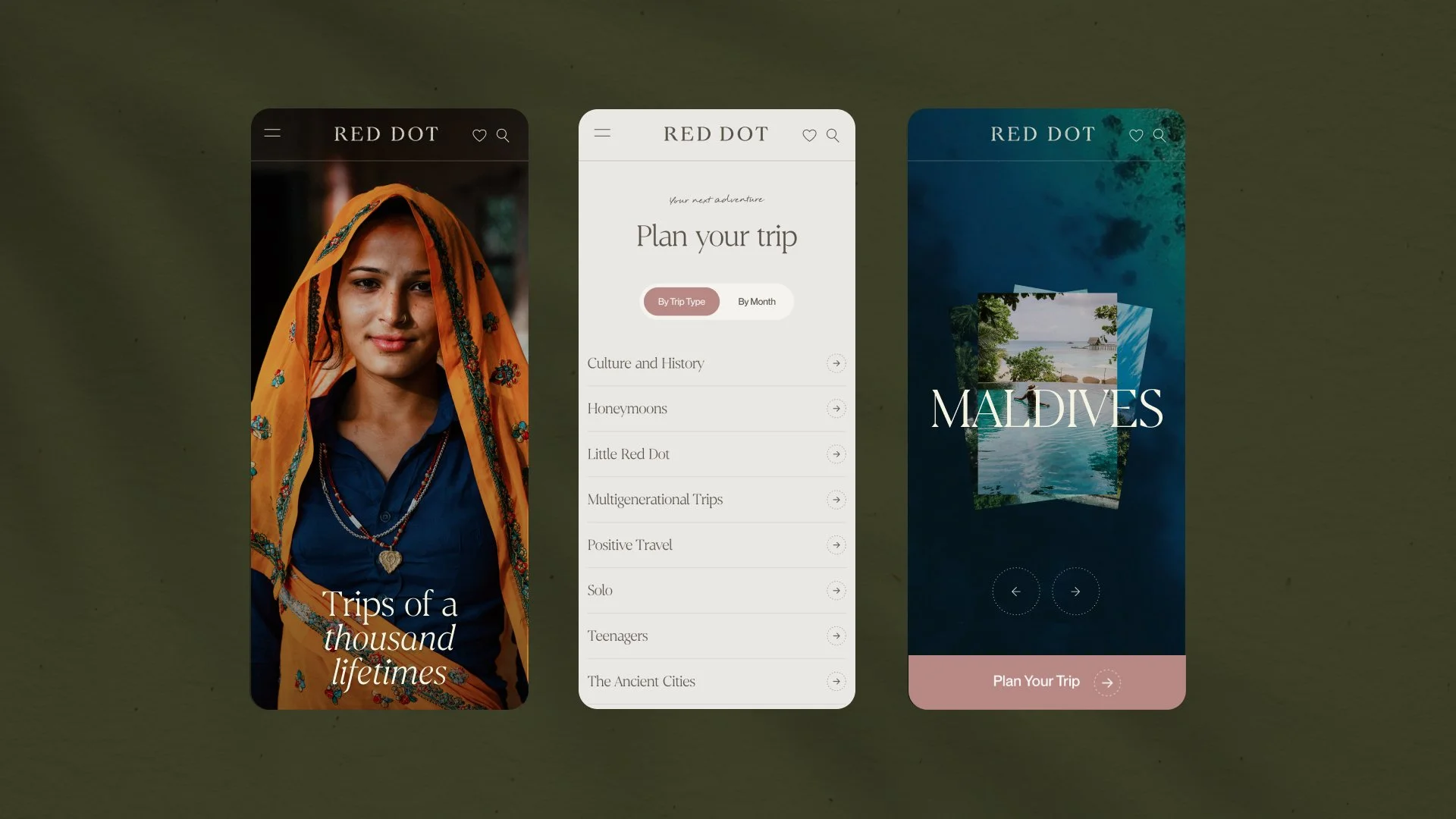
We partnered with them to translate this into a new positioning, voice and visual identity, that invites curious explorers to swap the guidebook for a good story.
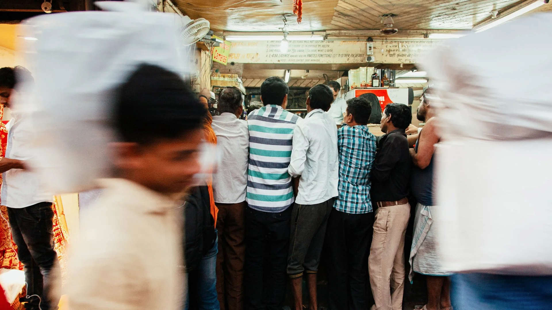
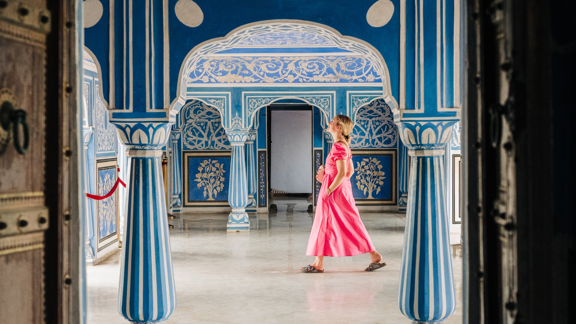
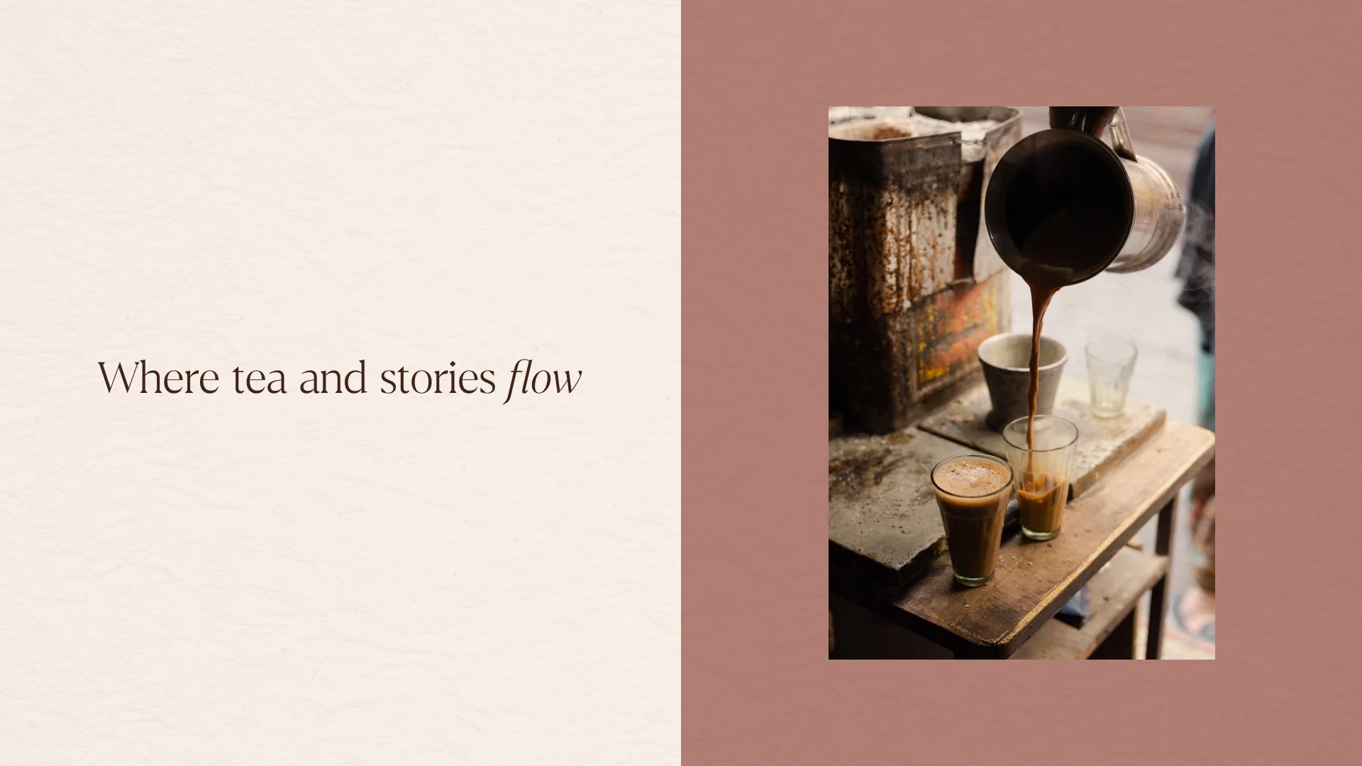
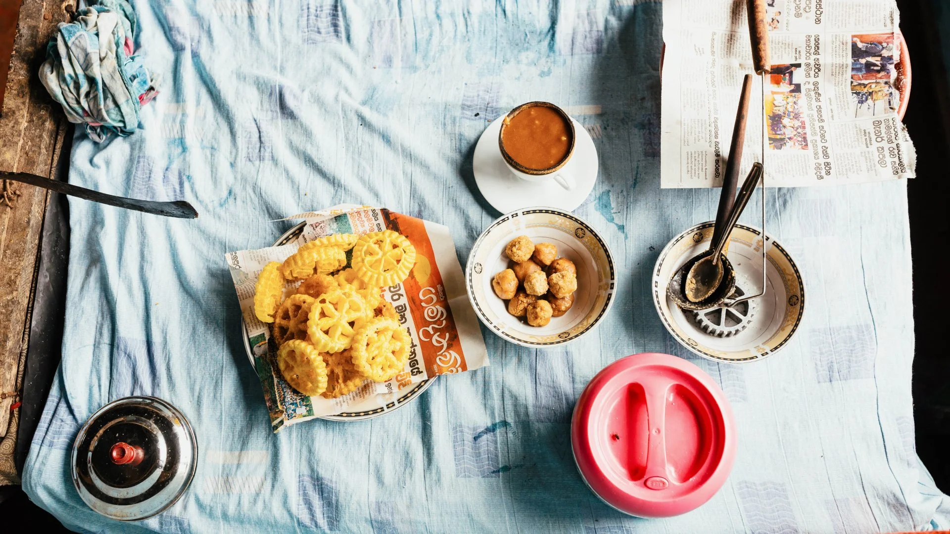
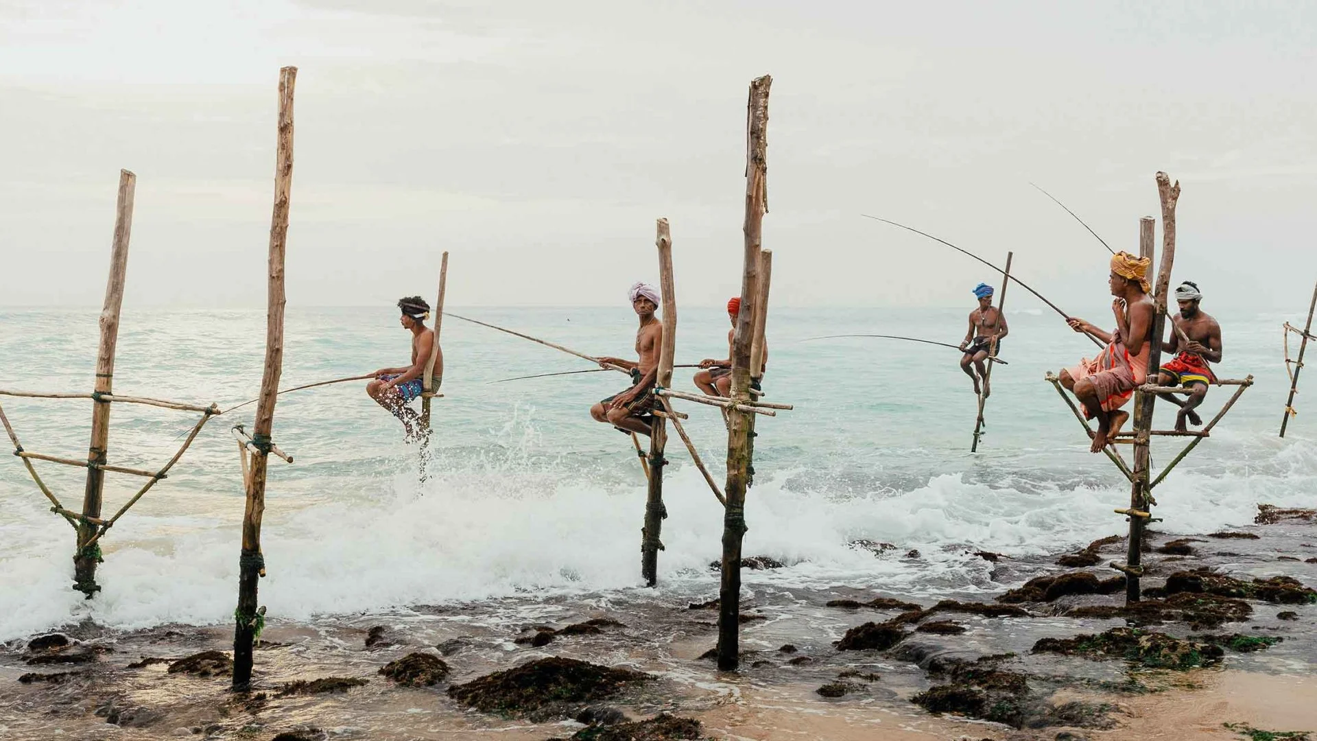
Today’s travellers are trading sightseeing checklists for meaningful experiences that bring them closer to local communities and culture.
Drawing inspiration from our own travel journals, we created a voice with a pulse that lets Red Dot’s on-the-ground knowledge shine through.
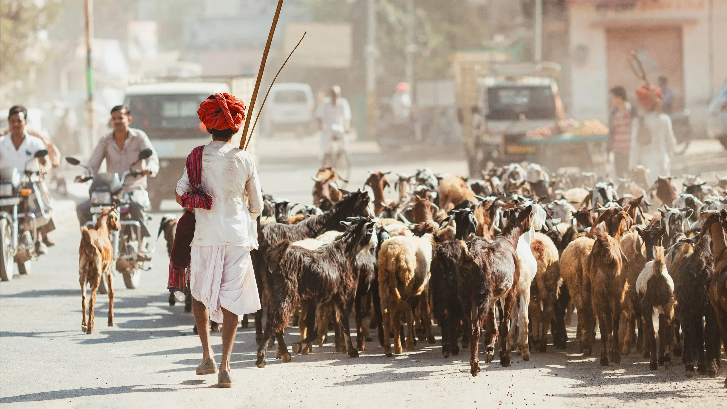
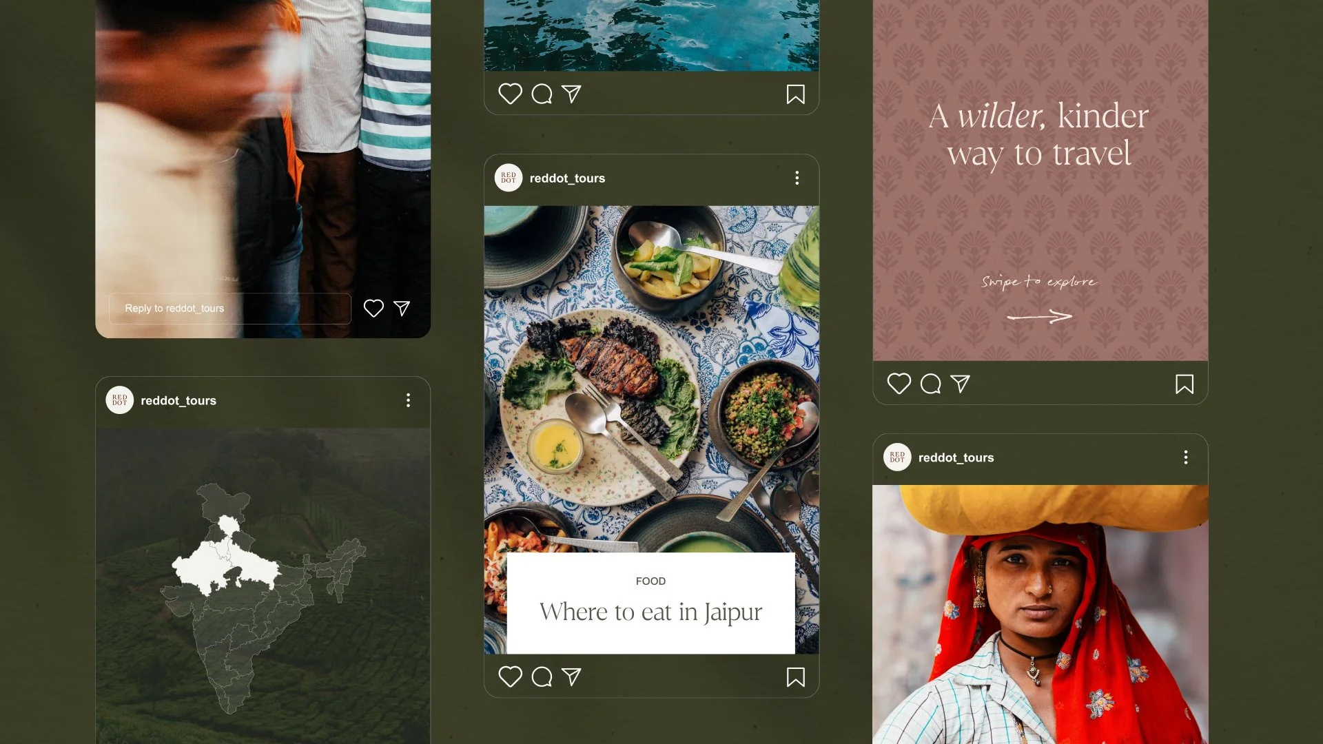
To match this energy, point-of-view photography and videography transport you to the centre of the action, whether zooming through the streets of Kandy in a tuk tuk or floating down the backwaters of Kerala by kayak.
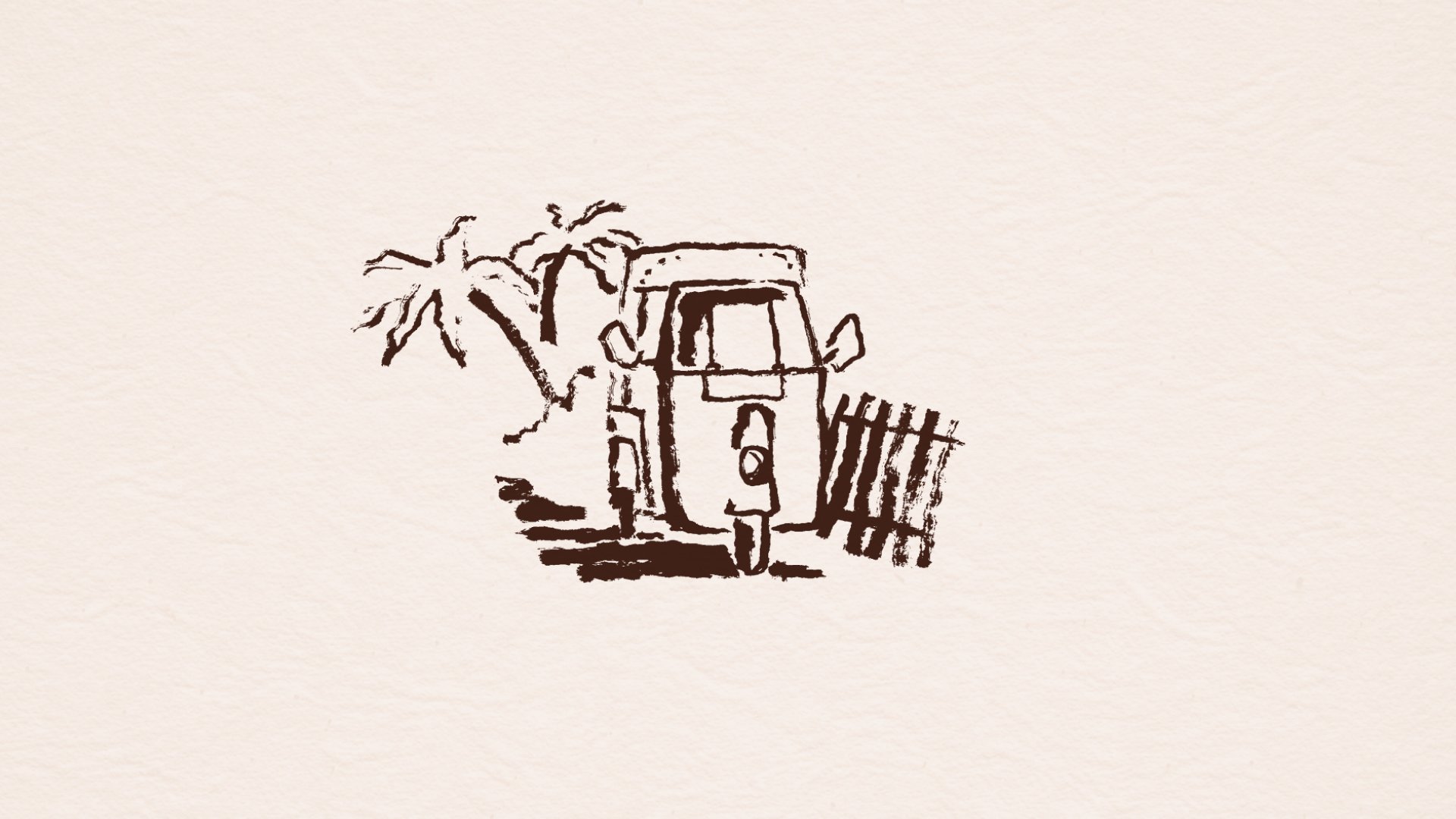
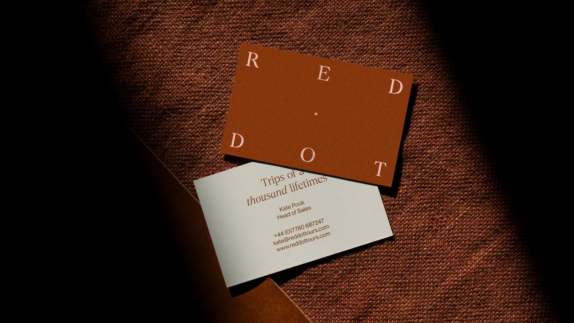
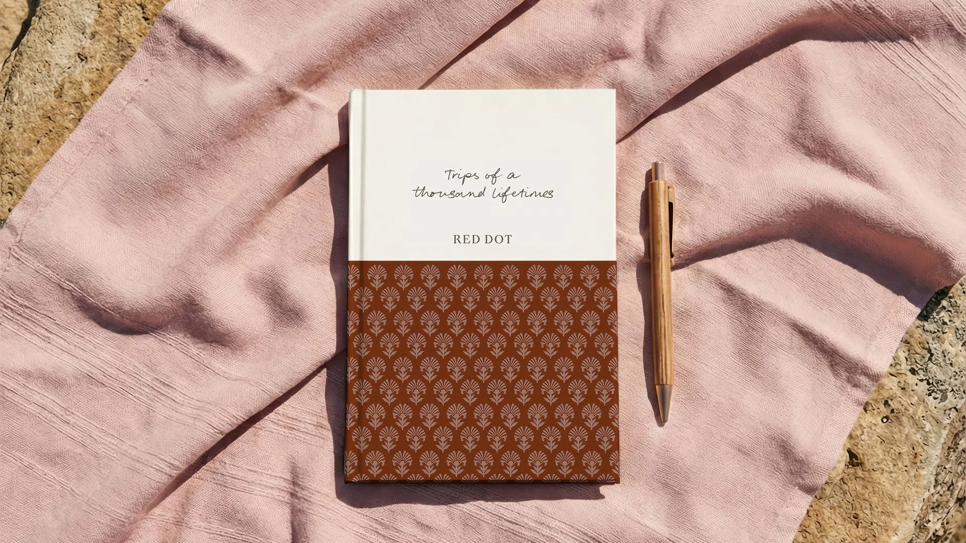
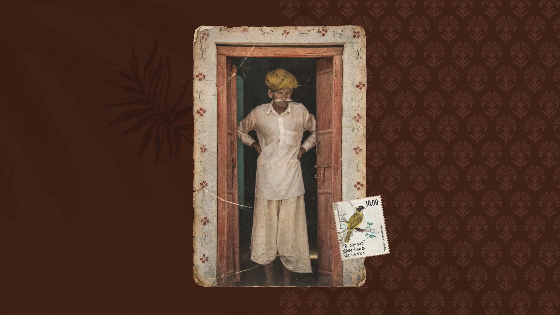
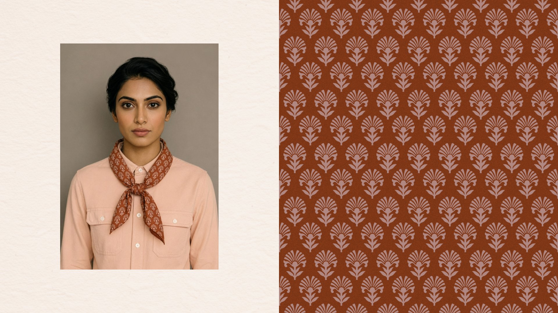
From the bespoke brand pattern, inspired by traditional motifs, to the logotype that reflects the character of Sri Lanka’s hand-painted typography, the visual identity is a celebration of heritage and culture.
The result is a brand that now reflects the people, passion, and personal touches behind every Red Dot trip.
“They took the time to really understand our business, worked collaboratively, and were genuinely invested in achieving the right outcome. What really stood out was their ability to combine clear strategic thinking with creative that felt both distinctive, niche and forward thinking.”
Project Credits
Creative Direction: Studio Form and Kirsten Murray
Positioning, messaging & tone of voice: Kirsten Murray and Zosia Swidlicka
Visual identity design: Studio Form
Website design & front-end: Studio Form
Website copy: Kirsten Murray and Zosia Swidlicka
Website build: Saberion
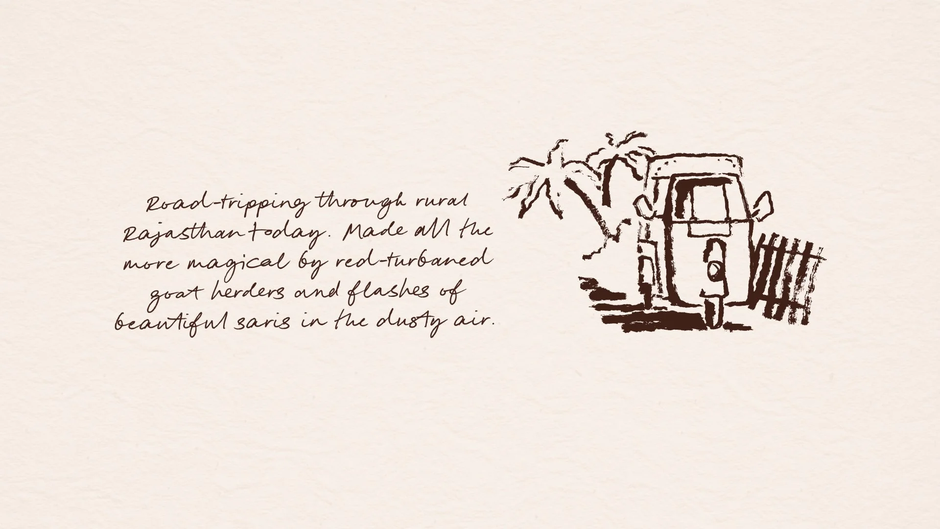
Illustration: Harry Grove
Project consultant: Kate Pook at Kapara