Edible

Edible is the menu builder and filter app that takes the guesswork out of sharing allergen and dietary information, making eating out a safer, more inclusive experience. The brand’s mission, to make the world more Edible, called for a gutsy voice and a visual style you can sink your teeth into.

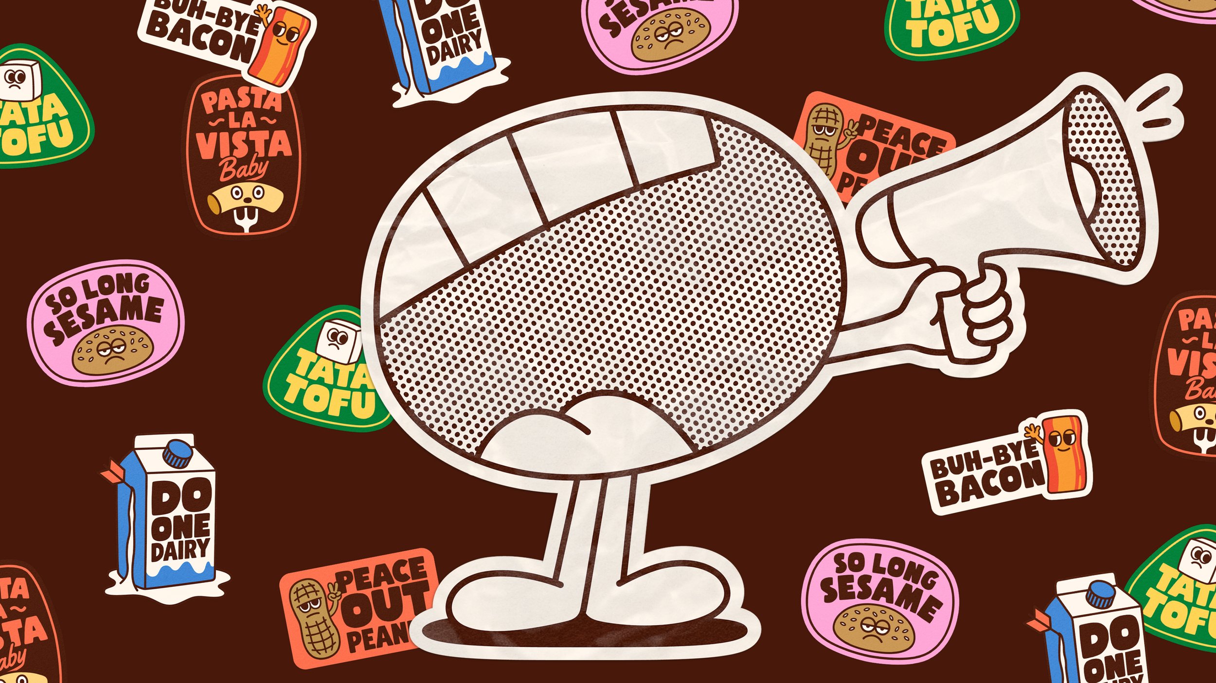
With a gooey, hand-lettered wordmark, doughy typography, and stomach-rumbling imagery, every element of the identity is designed to live up to Edible's name, all backed by a strategic 'menufesto'. Teaming up with illustrator Ant Gardner, we created a mouthy mascot called Nom, who personifies Edible’s promise to speak up for policy change in allergen labelling. There’s a foot-tapping, soda-swigging, or fork-wielding Nom for every brand attitude.

To help educate people about the allergens flagged by Edible’s menu filter, we created a series of illustrated stickers to bid these troublesome ingredients farewell – adding a touch of sassy humour to the identity.


“Starting out, we had zero presence or credibility – something that’s hard to earn but essential for growth. The brand identity has given us just that. It’s why our community and food businesses are taking us seriously. We now have the language and confidence to lead the conversation on food allergen labelling”
Services
Brand strategy
Creative strategy
Visual identity
Brand voice
Website design
Copywriting
Brand Guidelines
Big thanks to
Alex at Edible
Illustrator: Ant Gardner
Motion designer: Dan Plunkett
Awards
International Creative Award
3 x World Brand Design Awards
2 x Scottish Design Awards
